Kate Bush released Running Up That Hill in 1985. In the summer of 2022, after the song appeared in an episode of Stranger Things, it became one of the most-played tracks in the world among an audience that had not been born when it was recorded. Spotify reported the same year that its Gen Z listeners showed more nostalgic affinity for the 1980s than for any other decade, including the ones they had actually lived through.
This is a problem for the way marketing usually explains nostalgia. The standard account is retrieval: a customer sees a familiar package, recalls a childhood breakfast, and buys the cereal because the memory is pleasant and the product is attached to it. That mechanism requires a memory. A nineteen-year-old buying into 1985 does not have one.
There is a word for it
The writer John Koenig gave the feeling a name in The Dictionary of Obscure Sorrows, published in 2021. Anemoia describes nostalgia for a time a person never experienced. Academics had been circling the same territory for decades under less memorable labels, and the taxonomy is more useful to a marketer than it sounds.
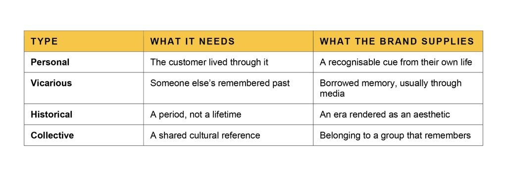
Personal nostalgia draws on your own past. Vicarious nostalgia borrows someone else’s. Historical and collective nostalgia attach to a period rather than to a life. Researchers Tom van Laer and Davide Orazi, examining precisely the Stranger Things effect, called what younger viewers experienced pseudo nostalgia, since the decade being longed for belonged to Generation X rather than to them.
The distinction matters commercially because the four types require completely different things from a brand. Personal nostalgia needs the customer to have been there. The other three do not, which enormously widens the addressable audience and, as we will see, opens the technique to companies that have no past to draw on.
What is actually being sold
If it is not memory, what is it? The psychological literature is unusually clear on this, and the answer reframes the entire craft.
Constantine Sedikides and Tim Wildschut at the University of Southampton have spent two decades establishing what nostalgia does rather than what it is. Working with Clay Routledge and others, they showed in the Journal of Personality and Social Psychology that nostalgia functions as a psychological resource: it reinforces identity, strengthens the sense of social connection, and helps people locate meaning. Later work with colleagues found that nostalgia activates safety cues and produces a calming physiological response consistent with feeling secure.
Read that again with a marketing brief in hand. The product of nostalgia is not recognition. It is reassurance. And reassurance does not require that the reassuring period ever happened to you, or indeed that it happened at all in the form being depicted.
Which explains the timing of the current wave. Mintel’s analysts put it plainly in their food and drink work: in a conflict-ridden world, consumers recognise what they have lost and what risks lie ahead, and they look for products that capture the feeling of familiarity and safety of the past. The audience is not buying 1985. It is buying a version of 1985 that appears calmer than 2026, assembled from films, photographs and other people’s stories.
The product of nostalgia is not recognition. It is reassurance.
Which is why it works on people who were never there
 The finding that should change a design brief
The most directly useful piece of research here appeared in the Journal of Marketing, where Alicia Kulczynski and Margurite Hook took Koenig’s term and made it operational. They introduced the concept of vintage anemoia to describe a consumer’s emotional connection to the aesthetics, styles and design of the past irrespective of any specific period or lived experience.
Then they tested what it does. Their work examined the effect of vintage typography on consumer perceptions of product safety, and this is the part worth taking into a design review: a typeface can change how safe a product is judged to be. Not how charming, not how authentic. How safe.
That is a functional claim about a design decision, and it follows logically from the psychology. If nostalgia activates safety cues, then the visual grammar of the past is a safety signal, and a customer with no memory of the period can read that signal perfectly well. The letterforms are doing the work that a memory was assumed to be doing.
What the brands are doing with it
The case files divide neatly into two groups, and the second is more interesting than the first.
The first group has heritage and is mining it. General Mills reissued five Big G cereals in packaging that reflected the year each was introduced, running Cheerios as 1945, Lucky Charms as 1964, Honey Nut Cheerios as 1979, Cinnamon Toast Crunch as 1984 and Reese’s Puffs as 1994. Nestlé marked seventy years of Shreddies with a golden crown on the pack and a hashtag inviting people to post their memories. General Mills brought back DunkAroos more than a decade after discontinuing them, having received thousands of requests to do so. M·A·C reopened its vault and relaunched nineties favourites, which Mintel’s beauty analysts identify as the retro theme with genuine staying power rather than a passing pop-culture tie-in.
Note what General Mills actually did, because it is subtler than a retro look. Each pack was dated to its own launch year, which means five different decades ran on shelf simultaneously. A shopper of any age found a version of the past that predated them and one that did not, and the design worked either way.
The second group has no heritage whatsoever. OffLimits Cereal and Olipop are recent companies using the visual language of the eighties and nineties without owning a single year of it. They are not reminding anybody of anything. They are borrowing an aesthetic that reads as safe and fun, and the borrowing works because the audience was never checking provenance in the first place.
Which raises an uncomfortable question about heritage
If a startup can buy the look, what exactly is a hundred-year-old brand holding?
The answer is that heritage confers permission rather than advantage. A genuinely old brand can use its own archive without the work reading as costume, and it can be specific in ways an imitator cannot: a real launch year, a real logo, a real advertisement from the period. What it does not get is exclusivity over the feeling. The comfort being sold is available to anyone with a good art director.
That is a warning rather than a reassurance for companies sitting on decades of unexploited archive material. An asset that competitors can approximate is an asset with a shelf life, and the value of being genuinely old declines every year that nobody does anything with it.
The honest counter-case
Not everyone accepts the framing. Charles Fairchild, who teaches popular music at the University of Sydney, has disputed the idea that this requires a new category at all, arguing that people have always been able to feel nostalgia for things outside their own experience and that the terminology inflates an ordinary human capacity into a discovery.
He has a point worth holding onto, because the commercial risk of this technique is precisely that it becomes a style rather than a strategy. Nostalgia is a mood, and moods are easy to imitate and quick to saturate. A category in which every brand simultaneously reaches for the same decade will find that the decade stops signalling anything at all, and the safety cue that made it work depends on relative scarcity in exactly the way any other distinctive asset does.
There is also a limit that the psychology implies but the marketing rarely acknowledges. Nostalgia works because it offers refuge from a present that feels demanding. It is therefore a countercyclical technique, most powerful when things are hardest, and a brand that builds its entire identity on retreat has nothing to say when the mood lifts.
What to take into the studio
The practical translation is short. Stop briefing for recall and start briefing for reassurance, because the customer you are trying to reach may have no memory to trigger and the safety signal works regardless.
Be specific about the period rather than generically old, since a dated reference reads as confidence while vague vintage reads as decoration. Put the cue where it can do work, which the typography research suggests means the letterforms and the palette rather than a heritage paragraph on the back of the pack that nobody reads. And treat the archive as a finite distinctive asset rather than a mood board, because the moment it becomes the category’s default look it stops being yours.
Sources: John Koenig, The Dictionary of Obscure Sorrows (2021), on anemoia · Alicia Kulczynski and Margurite Hook, “Typography Talks: Influencing Vintage Anemoia and Product Safety Perceptions with Vintage Typography”, Journal of Marketing (2024) · Clay Routledge, Constantine Sedikides, Tim Wildschut and Jacob Juhl, “Nostalgia as a Resource for Psychological Well-Being”, Journal of Personality and Social Psychology (2011) · Sedikides and Wildschut on nostalgia and safety cues (2018) · Tom van Laer and Davide Orazi on pseudo nostalgia · Charles Fairchild, University of Sydney · Spotify listening data on generational decade preference (2022) · Mintel, food and drink and beauty analysis on nostalgia marketing, including General Mills retro packaging and M·A·C vault relaunches · Nostalgia taxonomy after Stern (1992), Davis (1979), Goulding (2001), and Baker and Kennedy (1994).
Author: Ullash Chowdhury