
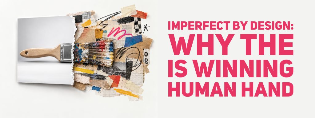
For most of the history of commercial design, polish was the point. A clean edge, an even gradient and a perfectly lit product shot told the viewer that someone had spent time and money getting it right. That signal worked because polish was hard to produce. In 2026 it is not. A flawless image now takes a sentence typed into a text box, and the effect on visual culture has been curious. The look that stands out has moved the other way, toward the rough, the handmade and the slightly wrong.
Canva gave the shift a name. Its 2026 design trends report, drawn from search data across a community of more than 260 million people, called this the year of “Imperfect by Design.” Searches for DIY and collage-inspired elements rose 90 percent, searches for zine-style and Substack-style editorial layouts rose 85 percent, and searches for a “lo-fi aesthetic” jumped 527 percent.
The paradox in the data
The retreat from polish is not a retreat from technology. In the same research, 77 percent of creators surveyed described AI as an essential partner, and 80 percent agreed that 2026 is the year to regain creative control. People are using the machines constantly and still reaching for styles that show a human was involved.
Cat van der Werff, Canva’s executive creative director, describes creators using AI on their own terms, with personal taste doing the work that software cannot. The report’s own trend descriptions make the tension concrete. One, which it calls Notes App Chic, celebrates scrapbook visuals, messy compositions and behind-the-scenes content, the unfinished thoughts and happy accidents that designers used to hide. Another, Zinegeist, traces a revival of cut-and-paste zine design in Mexico, where searches for brutalist design and type posters rose 77 percent as local creators looked for alternatives to overly digital aesthetics.
A third, Block Party, follows Spanish creators blending vintage tones, folklore and everyday pastimes into warm, nostalgic visuals, with searches for styles such as “Estética Tradicional” and “Folklore Urbano” reaching 1.5 million impressions. Across very different places, the pattern repeats: people are reaching for visuals rooted in memory, craft and local character rather than a single global gloss.
Why perfect stopped impressing
A signal only works while it is costly. For decades, a glossy finish implied a studio, a retoucher and a budget, so it communicated care and competence. When anyone can generate the same finish in seconds, it stops carrying that meaning. Viewers do not consciously reason this through, but they sense it. An image that looks too smooth now invites a quiet question about whether anyone actually made it.
Imperfection answers that question before it is asked. A wobbly hand-drawn line, a visible pencil mark, a scanned paper texture or a sticker placed slightly off-centre all read as evidence of a person at work. They also carry warmth. A collage looks like someone chose each piece, and a hand-lettered label looks like someone cared about this particular product. In a feed crowded with frictionless images, those small traces of effort become the thing that catches the eye.
There is a practical side too. Rough styles are forgiving. A small brand or a single creator cannot outspend a global company on polish, but it can match it on personality, and a handmade look rewards taste and idea over budget.
The appetite for the unusual goes further than handmade. Canva recorded a 220 percent jump in searches for “liminal” and “uncanny” content, the eerie, dreamlike and slightly off-kilter imagery that feels deliberately strange. Whether a design looks handmade or unsettling, the common thread is that it does not look like the smooth, predictable default that machines produce most easily.
The colour of quiet
The same restlessness shows up in colour. Pantone named Cloud Dancer, a soft, airy white, as its 2026 Colour of the Year, the first white it has ever chosen. The Pantone Color Institute presented it as a calming influence for a frenetic society rediscovering quiet reflection, and its executive director, Leatrice Eiseman, described the surrounding noise as having become overwhelming.
Colour trends of this kind travel quickly into products. Cloud Dancer has been licensed onto everything from Motorola phones and Post-it Notes to Play-Doh, which shows how fast a mood identified by designers becomes something consumers can buy.
At first glance a blank white seems the opposite of a messy collage. Both, though, respond to the same fatigue. One strips visual noise away entirely, and the other replaces machine-made sameness with something personal. Canva’s data shows both impulses at once: alongside the surge in DIY and lo-fi searches, interest in clean layouts and simple branding grew 54 percent. Designers are not choosing chaos over order. They are rejecting the glossy middle.
Where the hand shows
The shift is visible well beyond social posts. Packaging increasingly uses hand-lettered type and illustrated labels. Brand identities that once favoured sleek geometric marks now allow for brush texture and irregular lines. Editorial design borrows from zines, with cut-out images, typewriter fonts and layered paper. Even digital products lean on stickers, doodles and scribble-style annotations to feel friendlier.
Bangladeshi readers have a head start in understanding the appeal. The country’s visual culture has long been shaped by the human hand, from the painted rickshaws of Dhaka, recognised by UNESCO as intangible cultural heritage in 2023, to hand-painted truck art, cinema hoardings and the stitched stories of nakshi kantha. These traditions were never trying to look machine-made. The global design conversation is, in a sense, arriving at a value that local craft has always held.
What brands can take from it
For brands, the lesson is less about adding fake scribbles than about letting real human choices show. That can mean commissioning illustrators and hand-letterers rather than generating every visual, using real photographs of real people and places, or letting packaging carry a drawn detail that no competitor has. It can also mean loosening social media templates so that posts feel made rather than stamped out.
Recognition still matters. A brand that turns every asset into a messy collage risks becoming hard to identify, so the most effective approaches keep the core cues fixed, the logo, the colours, the product itself, while allowing the handmade elements to add warmth around them. Used that way, imperfection becomes part of the brand’s personality rather than a trend it is chasing.
The catch
Every signal wears out once it becomes easy to fake, and imperfection is no exception. AI tools can already generate convincing grain, fake brushstrokes and collage effects on demand. If the handmade look becomes just another preset, it will lose its meaning the same way polish did, and viewers will learn to spot manufactured messiness as quickly as they spotted stock photography.
That suggests the lasting lesson is not about texture at all. The designs that hold attention show genuine choices: a real drawing, a specific reference, a decision only this designer or this brand would have made. Imperfection works when it is evidence of a person. When it becomes a filter, it is simply a new kind of polish, and the eye will move on to whatever looks human next.
Author: NUSRAT TABASSUM


